GDS-108 Design Principles
Wednesday, October 4, 2017
HW 7
This is the logo for 3 Doors Down, I really enjoy this logo because it has many things that I love. One of the things are eagles, it shows patriotism and a love for America. Second, is how the bird is flying through the number. Lastly, the gold splashing in the background give it some fun and shows just how rich we are in this nation.
Wednesday, September 27, 2017
hw6
This graphic demonstrates depth extremely well, by how the texts fade in front and behind of the texts, giving the illusion that the graphic has some depth to it.
Wednesday, September 20, 2017
HW 5
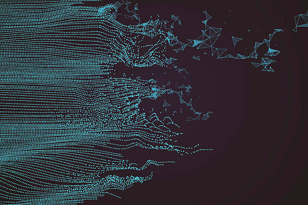
I think this is a great representation of rhythm because the dots are in a pattern and give the illusion of making waves and breaking off.
Wednesday, September 13, 2017
HW4
With this blog i'm gonna talk about balance inside of this design. This design represents symmetrical balance, because the image is completely the same on both sides throughout the whole design. The only difference on the two sides is the weight of the sun and tiles. The tiles on the left are reflecting the stone work in the background because of the direction of the sun. However, the reflection completely matches the area that is being reflected except it is cut off where the tile begins to lose its "shine".
Wednesday, September 6, 2017
HW3
This is the logo for Unreal Engine, the unity can be found in the circles leading down to the circular logo, additionally the colors give some unity by all being a orange metallic look with the white of the logo reflecting onto it, as if it was merging with it.
Wednesday, August 23, 2017
HW2
This is advertisement for an Orchard that makes cider. There are many ways cider can be made, however this represents hard cider. What many people don't know is that cider, whether alcoholic or juice, can have its flavor changed by a single apple. Sweeter apples make a sweeter cider, where as tart apples make tart cider. This hard cider is being aged in the barrels, and the longer the cider sits, the more its taste will change. This shows each barrel with numbers on it so that they can tell how long its been sitting. Inside each different set of barrels is a different kind of cider. The reason I think this is such a good design is because of the old aged barrels, it makes it seem authentic, and the barrels all look different. Additionally, I really enjoy the graphic on the bottom left, it shows class, elegance, and a bit of age.
Subscribe to:
Posts (Atom)


